Accessibility and alternative text
It is possible that we may also publish your work as an eBook or in another digital format. As ACER Press is committed to exploring and pursuing digital accessibility for those with disabilities, we seek to ensure our eBooks and other digital content significantly comply with standards and recommendations in this area.
Some aspects of accessibility can involve a level of technical skill, which we of course leave in the hands of our editors, designers and developers. However, there are areas in which you as an author can make a significant contribution to your book being accessible early in its life. To begin the move towards accessibility:
- ensure your content has a logical and easily navigable structure
- focus on clarity of content and meaning
- provide alt text descriptions for visual material in your manuscript.
Each of these 3 areas is elaborated below.
Structure
Text is more easily understood by those with a print disability and by screen reading software when it is structured, follows a logical reading order and can be navigated with ease. It is important that the hierarchy of content in your manuscript, such as headings, is logically organised and that readers can readily locate content.
- Ensure headings and hierarchy are clear and follow a logical order.
- Style headings consistently.
- Cross references to figures, tables and other sections should be logical and clear; figures and tables should be referenced by number.
- Elements like margin notes and text boxes can adversely affect logical reading order on screen readers, so should be avoided or used sparingly.
- Similarly, footnotes can interrupt reading order; they should be avoided or used sparingly.
Content
Accessibility can also be facilitated through the clarity of meaning and detail in the content itself.
To help make content more accessible:
- avoid unnecessary ambiguity
- where possible, avoid ambiguous words, including those that may have more than one meaning (heteronyms). This is not a significant issue where the surrounding context makes the intended meaning clear. However, sometimes the use of a heteronym may not be that clear, as in the following example: ‘I gave a small bow to the princess’. Here it might be unclear whether I am bowing physically or whether I am giving the princess a gift to wear in her hair
- avoid language and cross references that use ‘visual’ pointers, like ‘above/below’, ‘background/foreground’ or ‘on the left/right’
- make sure cross references are clear
- use tables only where necessary and, where they are required, try to make them small; relationships between data can often be described in the text itself and some things presented in tables may be better in lists
- in educational content, carefully consider questions connected to a graphic; readers should still be able to get what they need from the graphic to answer the question, regardless of how they access the text
- do not indicate meaning solely through colour (e.g. in a graph) or images
- avoid text as graphics (e.g. word clouds)
- avoid the overuse of character formatting (e.g. italics and bold) to convey meaning.
Alternative text
Alternative text, or ‘alt text’ conveys the meaning of images, particularly for those with visual or print impairments and users of screen readers.
In your manuscript, please include alternative text under figures or images. This should ideally be presented between angle brackets in the format
During the copyediting phase of your book’s production cycle, we will be happy to work with you to tweak or hone alt text descriptions. We would, however, like to offer you the initial opportunity to compose your own alt text, so that you can highlight the content and context you feel is most central to the figures and images you have chosen to include.
General tips
- Be as concise and clear as possible, as excessively long explanations can encumber screen reader users.
- Phrases like ‘a picture of …’ or an ‘image of …’ are unnecessary, as screen reading technology already indicates that alt text describes images.
- Punctuation such as commas and full stops is usually read by screen readers and will result in pauses in the ‘announcement’. However, do not include unnecessary formatting in alt text, such as bullet points.
Images in your manuscript might be:
- informative
- functional
- images of text
- complex
- decorative.
Informative images
Informative (simple) images should be accompanied with an alt text description that contains:
- a short description of the content in the image
- the image’s context, purpose or significance, if that is not already obvious elsewhere in the text.
E.g.

Figure 1. ‘Patch’
< alt=”a brown and white domestic dog wearing a collar”>
Note that in the above example, the alt text is not the same as the caption. Captions do not necessarily provide a complete description of what is included in an image.
Functional images
Functional images, such as a buttons, icons or links, should also have a short description.
E.g.

< alt=”print this page”>
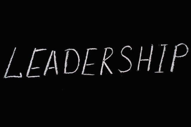
If your manuscript contains images of text, your alternative text should repeat the text that is included in the image.
E.g.

< alt=”leadership”>
Complex images
Complex images in your manuscript might include graphs, charts, diagrams or maps. These can be more difficult to describe using alt text. Your description of complex images should contain:
- type of image (e.g. bar graph)
- type of data (e.g. number of students enrolled in state schools in Australia in the last year)
- the most important elements and the reason for including the image in the text (e.g. NSW had the highest percentage of students enrolled in state schools last year)
- a possible link to or mention of the location of the data source or more detailed information (e.g. see Appendix).
E.g.

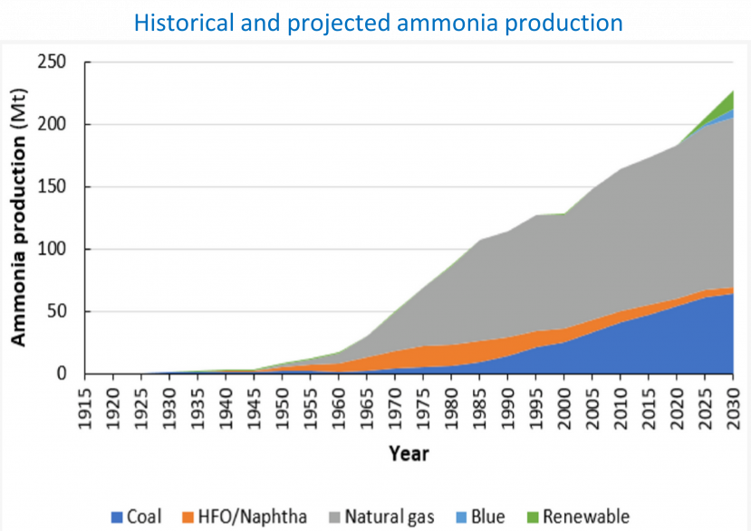
Rouwenhorst, K. H. R., Travis, A. S., & Lefferts, L. (2022). 1921–2021: A Century of Renewable Ammonia Synthesis. Sustainable Chemistry, 3(2), 149–171. MDPI AG.
< alt=”Line graph describing the Historical and projected ammonia production. The x-axis represents the year (increasing at 5-year intervals) and the y-axis represents ammonia production (at an interval increase of 50 Mt). There are 5 categories in various colours including Coal, HFO/Naphtha, Natural gas, Blue and Renewable. The graph shows a very slow increase from 1915 to 1945 of 0 to 10 Mt. From 1946 to 2030 there is a steady increase in all categories, with Natural gas, Blue and Renewable showing the most significant rises in ammonia production (up to approximately 225 Mt).”>
Complex images often contain more detailed content than can be delivered in a short sentence or phrase. Where this is the case, both a short and a long description may be warranted. The short description identifies the image and indicates the location of the long description. More about complex images and short and long descriptions can be found at:
https://www.w3.org/WAI/tutorials/images/complex/
If your book contains graphs or charts that are too complex to describe entirely using alternative text, it may be useful to include the data source or raw data. In an eBook, such information could be included in an Appendix. When submitting your manuscript, please provide ACER Press with any relevant raw data or data sources linked to graphs, charts, etc. (This may also help our designers prepare any figures that need to be ‘redrawn’).
Decorative images
Decorative images do not necessarily require descriptions. However, screen readers may still attempt to read these. In order for assistive technologies to ‘ignore’ decorative items, we will need to pass this information on to our designers and eBook creators. If you intend any images in your manuscript to be purely decorative, please include an 'empty' alt description:
< alt=””>